
Quick Look at New Cars on Czech Roads
When I was once driving home, discussing family cars with my boyfriend, I started wondering about the kinds of cars people buy nowadays.
Is it still Skoda and Volkswagen, or is there finally some change in the air? What’s the proportion of electric vehicles? And how many of those vehicles are imported from different countries? I then began to wonder whether this data was publicly available somewhere.
Having recently finished the Data Sketches book by Nadieh Bremer and Shirley Wu, I was inspired to try creating a poster with this information—a format I’d never tried before.
A quick search led me to the Ministry of Transport, which seemed to have the exact data - about new vehicle registrations, even with archives covering multiple years. One day sometime later I finally managed to find some time and sat down at my computer and downloaded the data. To my disappointment, I found out that the quality wasn’t great, and I deemed it unusable. After more searching, I discovered the Vehicle Registration Datacube, where I managed to obtain all the necessary data (all vehicle registrations in the Czech Republic from January to July) in good enough quality.
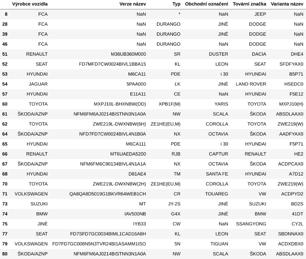
Upon closer inspection of the data I found many typos in dates (e.g., “0215” instead of “2015”), but after fixing those, the dataset was ready to go. I tried to write down the questions I was curious about and wanted them answered (and ideally also visualized):
- What’s the proportion of newly bought cars versus those imported from other countries?
- What’s the proportion of hybrids and electric cars (maybe also comparison to previous years)?
- Top 5 models purchased?
- Most popular brands - are Škoda and Volkswagen still leading?
- What colors are trendy?
- What’s the most popular month for buying a car? Probably not right after Christmas?
With my questions in mind, I loaded the data into Python and got ready to dig in.
I decided to focus on the M1 vehicle category, which includes passenger vehicles with up to eight seats in addition to the driver’s—essentially the standard cars people buy for personal use, excluding large trucks and similar vehicles.
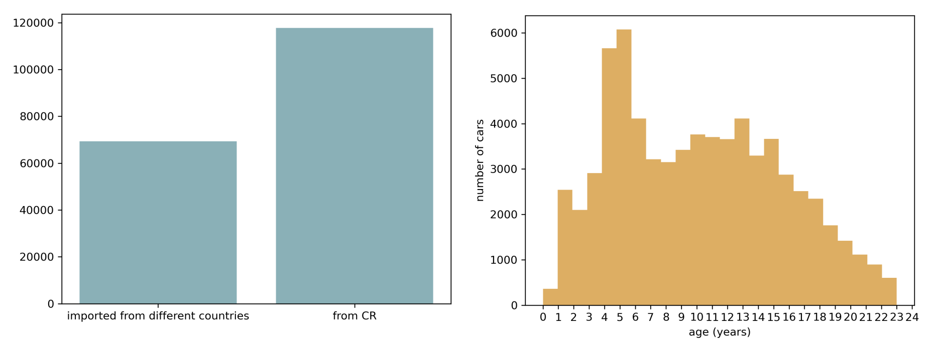
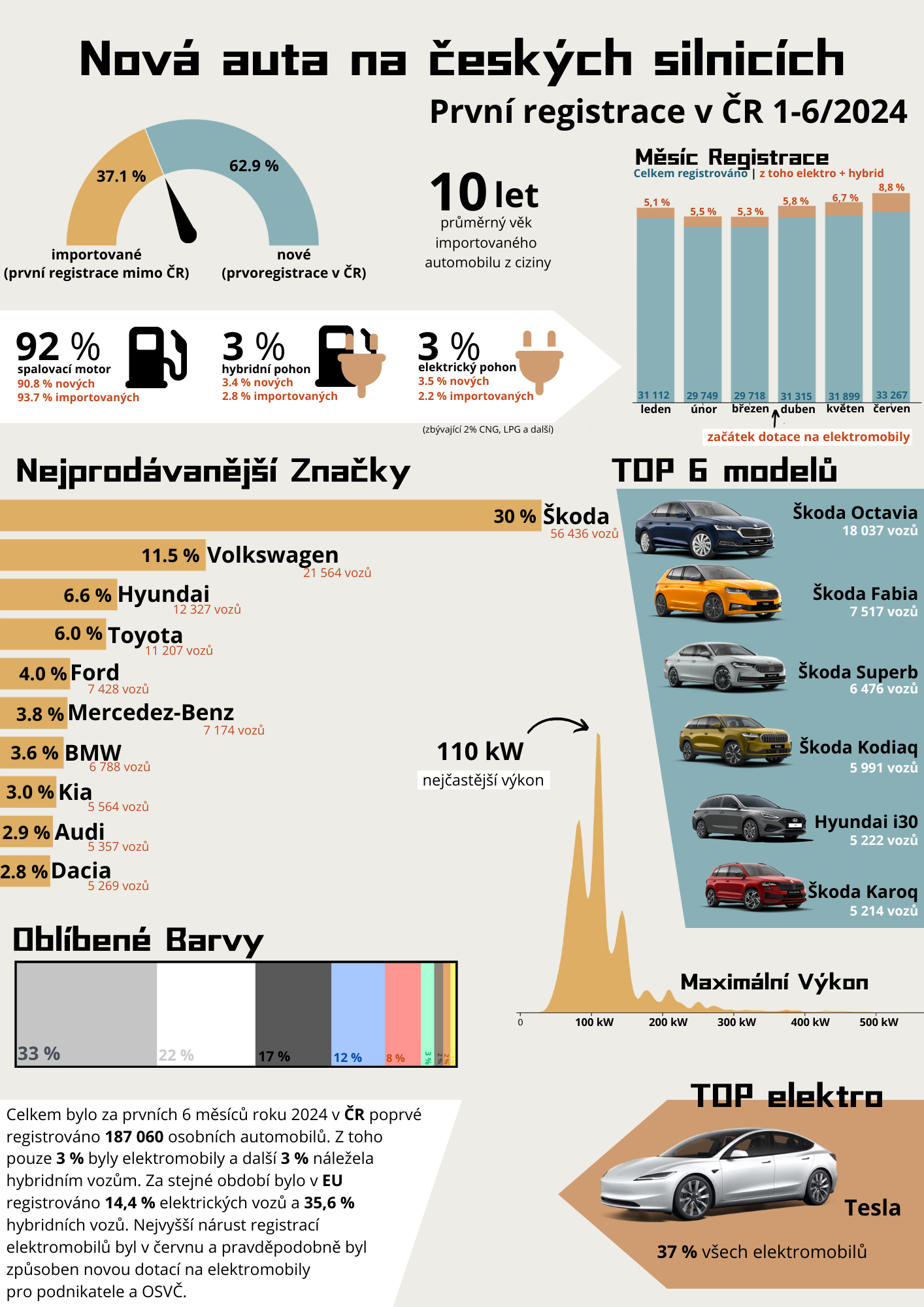
First, I looked inspected the numbers for newly bought cars versus imported ones. The results weren’t so surprising, but what definitely did surprise me was that the average age of an imported car was 10 years! And that was even after filtering out cars that over 25 years old (registered before 2000) - as they hopefully aren’t regularly driven on the roads. No wonder I see so many old cars on czech roads.
The variety of fuel types also surprised me—why is ethanol even in there? I assumed that the differences between “diesel + electric” and “electric + diesel” were due to different hybrid types, like plug-in hybrids, mild hybrids, and so on, and decided to group them all under a single “hybrid” category. So in the end, I merged the fuel types into five groups: diesel, petrol, electric, hybrid, and other.
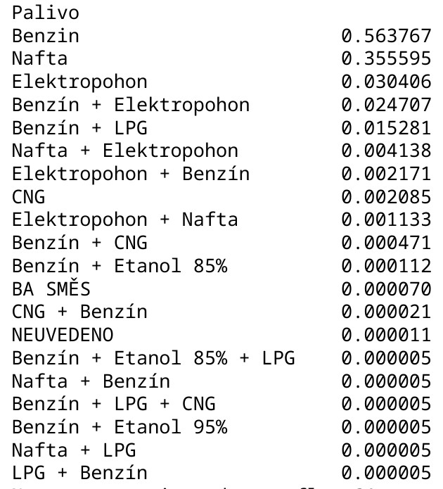
After merging, I discovered that only 3% of cars were electric and, with another 3% being hybrids. Curious about how this compared to the rest of Europe, I found that the EU average is 14.4% for electric vehicles and 35.6% for hybrids. As the results for czech republic felt quite low, I decided to do further research online. It turned out the data was accurate: the Czech Republic lags behind most of the EU in new electric vehicle purchases. This alone would not surprise me, but the gap was much larger than I anticipated.
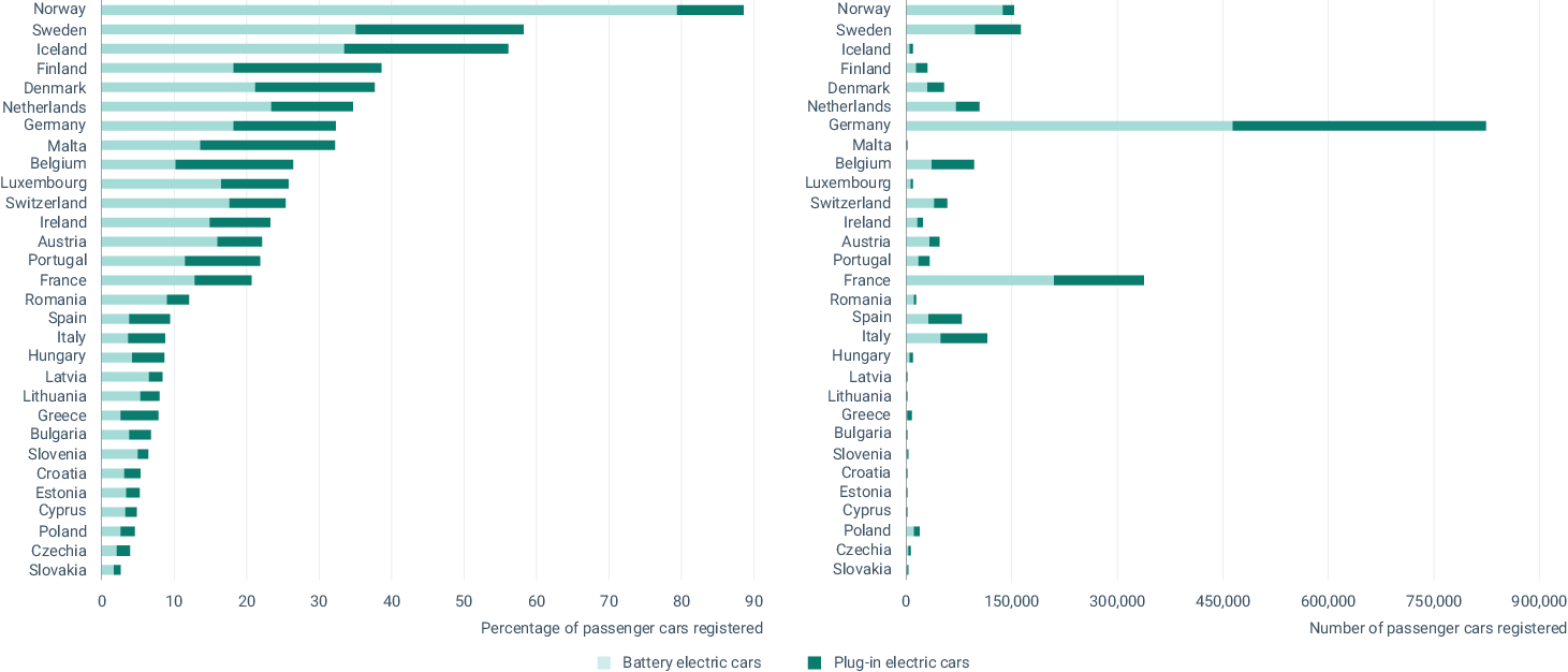 Source: European Environment Agency
Not gonna lie, learning this fact made me a bit sad.
What didn’t surprise me, though, were the most popular car brands. As expected, Škoda and Volkswagen dominated the market, with Škoda accounting for nearly a third of all new cars. Volkswagen managed 11.5%, while Hyundai and Toyota each captured over 6%. All other brands made up only a few percent.
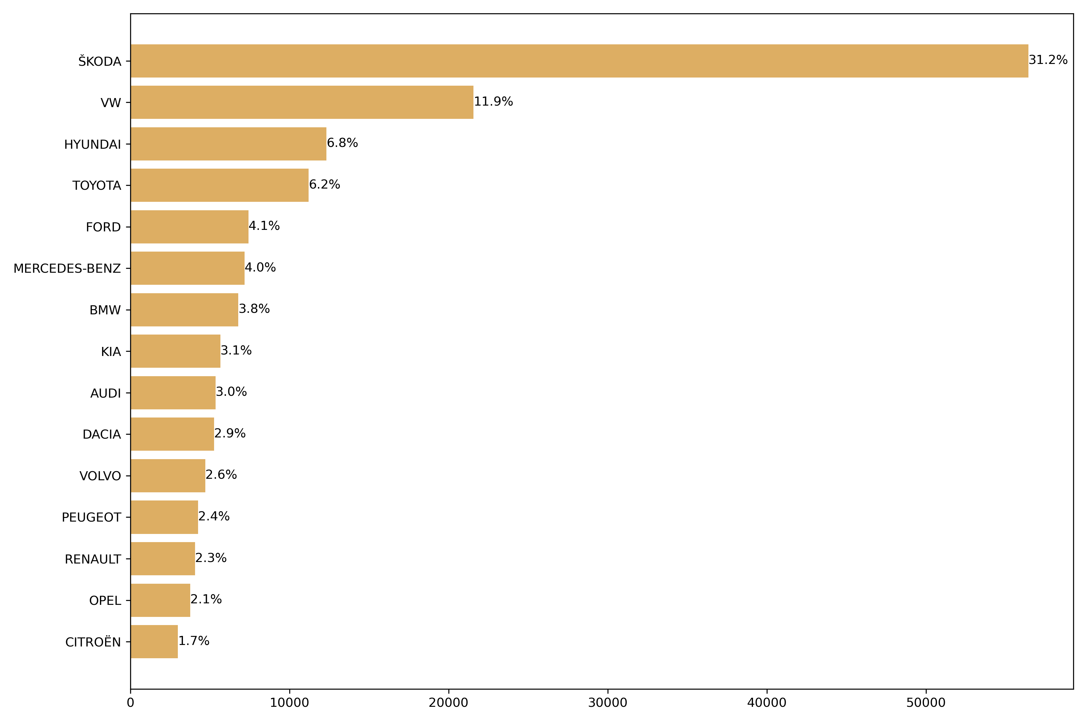
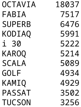
Thanks to Škoda’s massive market share, five of the six most purchased cars were Škoda models. The only exception was the Hyundai i30, which managed to break into the top ranks. For pure EVs (not hybrids), the most popular brand was Tesla, accounting for 37% of all new EVs.
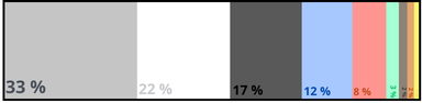
The three most popular colors were, unsurprisingly, gray, white, and black, followed by blue and red.
Registrations were fairly evenly distributed over the six months, with perhaps a slight upward trend. There was an EU initiative aimed at boosting EV sales, which led the Czech government to introduce a program offering businesses a discount of up to 300,000 CZK on electric vehicle purchases—a significant incentive. This initiative began in mid-March, and I believe the first EVs bought through this program appeared in April. (By the way, the 2 billion CZK allocated for this program was fully used up by the end of October, making it quite a success.) So, I wondered if I will be able to see higher number of EV registrations from April onwards.
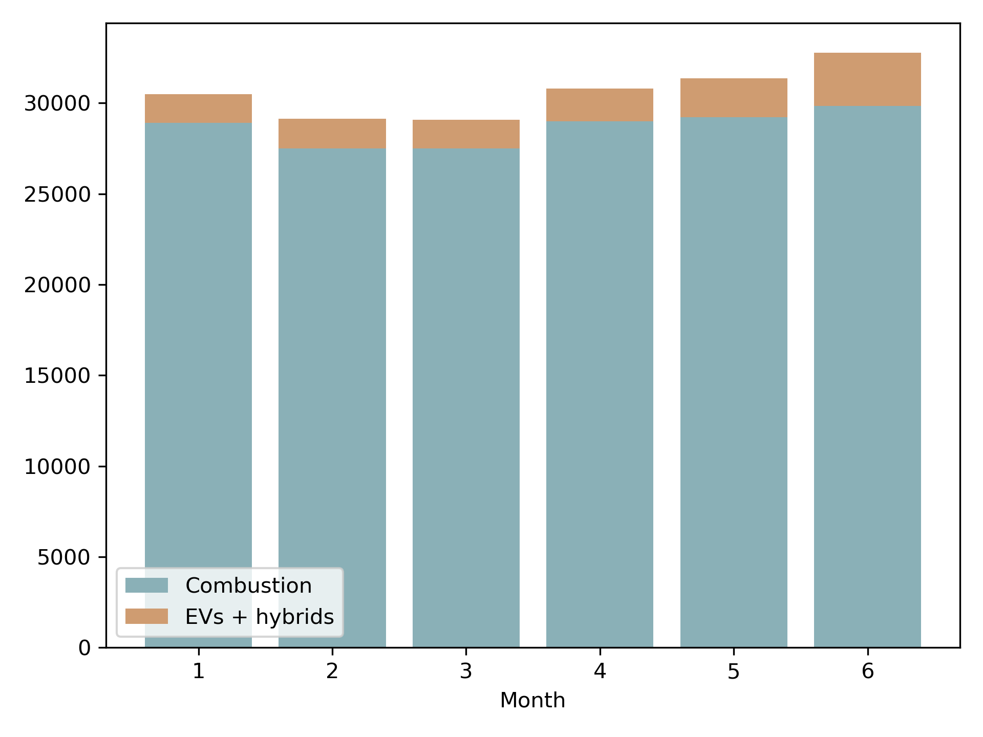
And yes, there really was a bump in EV registrations after April (yay!). This chart shows EVs combined with hybrids, and increase was seen for both of these types. However, the biggest difference in June was caused majorly by pure EVs, getting from 1041 sold in May to 1861 sold in June (while hybrids stayed roughly the same - 1092 in May and 1070 in July). I think the the growth will be even bigger in following months, as businesses find out about the discount. I would like to make a separate analysis of the results of this initiative in the future, as I find it quite interesting.
After crunching the numbers it was time to make the poster idea into reality.
As I’ve never created a poster before, I did some research on what tools to use. I was playing with the idea of using D3.js, but after seeing the overhead of creating a simple bar chart in D3.js, I decided not to go in this direction. (However, I understand the appeal of being able to control every figure aspect in D3.js and definitely want to revisit it in the future!). In the end I decided to stick to something I know and that is generating the figures in Python. For the poster itself, after some searching, I found Canva, which seemed to do what I needed, without any harsh learning curve.
Before I started with the poster itself, I did a quick sketch of my imagination (I decided to use the Czech language for the poster, as it was the target data country). My first sketch looked like this :D
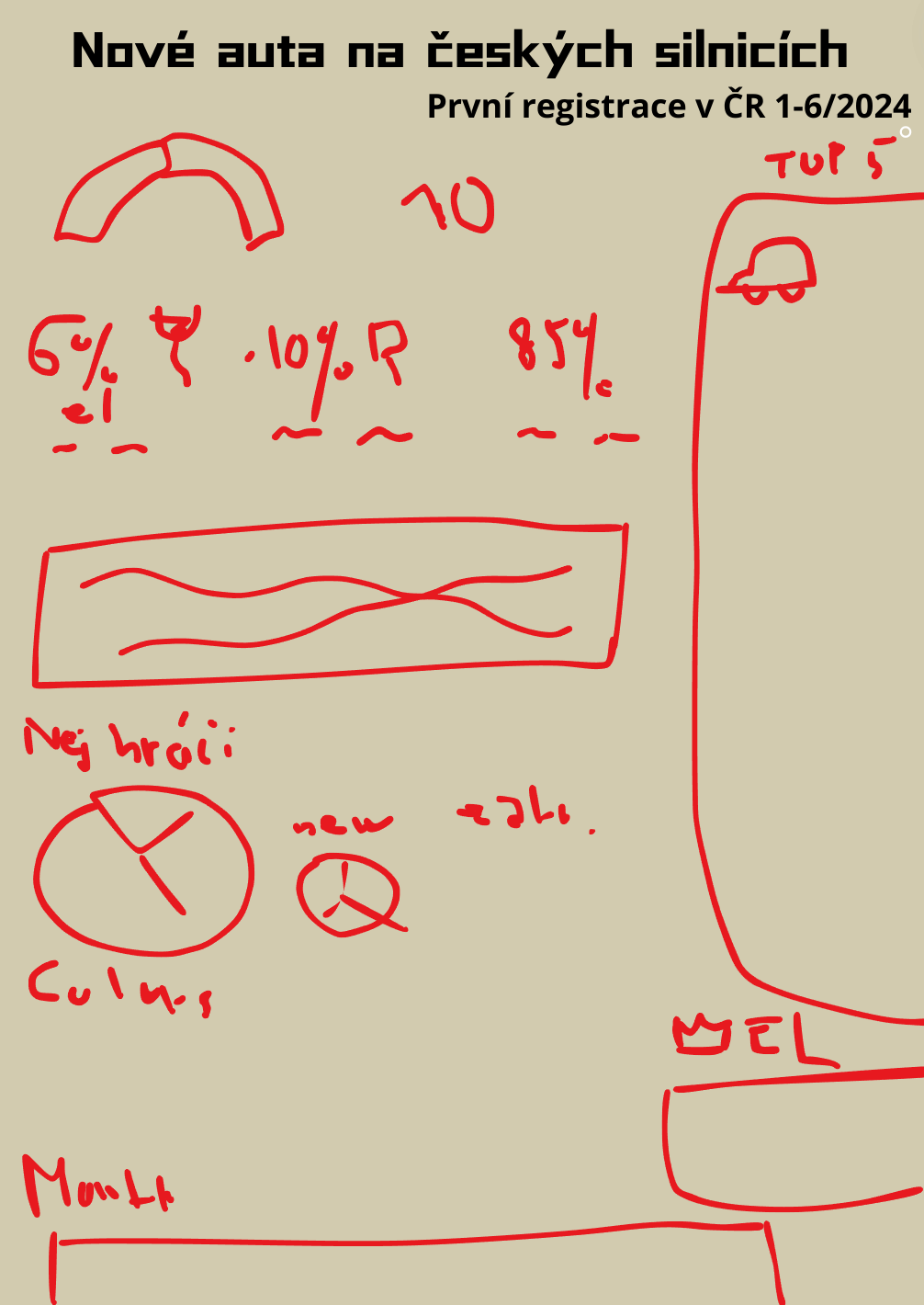
I quickly got the idea to use a speedometer gauge to represent the proportion of new versus imported cars. It felt like a natural and fun choice for this type of data. However, implementing it in Python proved to be quite tricky. While I managed to create the half-doughnut chart, adding the arrow turned out to be a challenge.
Luckily, good old GIMP combined with Canva came to the rescue. With some extra effort, I created a gauge chart that felt acceptable:

The other charts were more straightforward to create. Using Canva for labels made the entire process much easier and gave the visuals a polished look.
One of my favorite ideas was showcasing the most popular car models. To my delight, I found high-quality downloadable images of models from Škoda, Hyundai, and Tesla in formats like AVIF, PNG, and WebP. These visuals added a lot of character to the poster and really helped bring the data to life.
During an intensive one-day design session, I went through three or four iterations of the poster design. Each iteration brought me closer to a more polished and cohesive look.
After showing the intermediate posters to my boyfriend, he provided some really valuable feedback, particularly about the flow of the text. He pointed out how he perceived the different sections of the poster and suggested improvements to make the layout more intuitive. With his input in mind, I went back for one last iteration—and voilà, the final result was ready:
Creating this poster turned out to be a surprisingly fun experience, even though the results is certainly nothing exceptional. As my first attempt at a data visualization poster, I’m quite happy with it. I’d love to explore something similar with different datasets in the future.